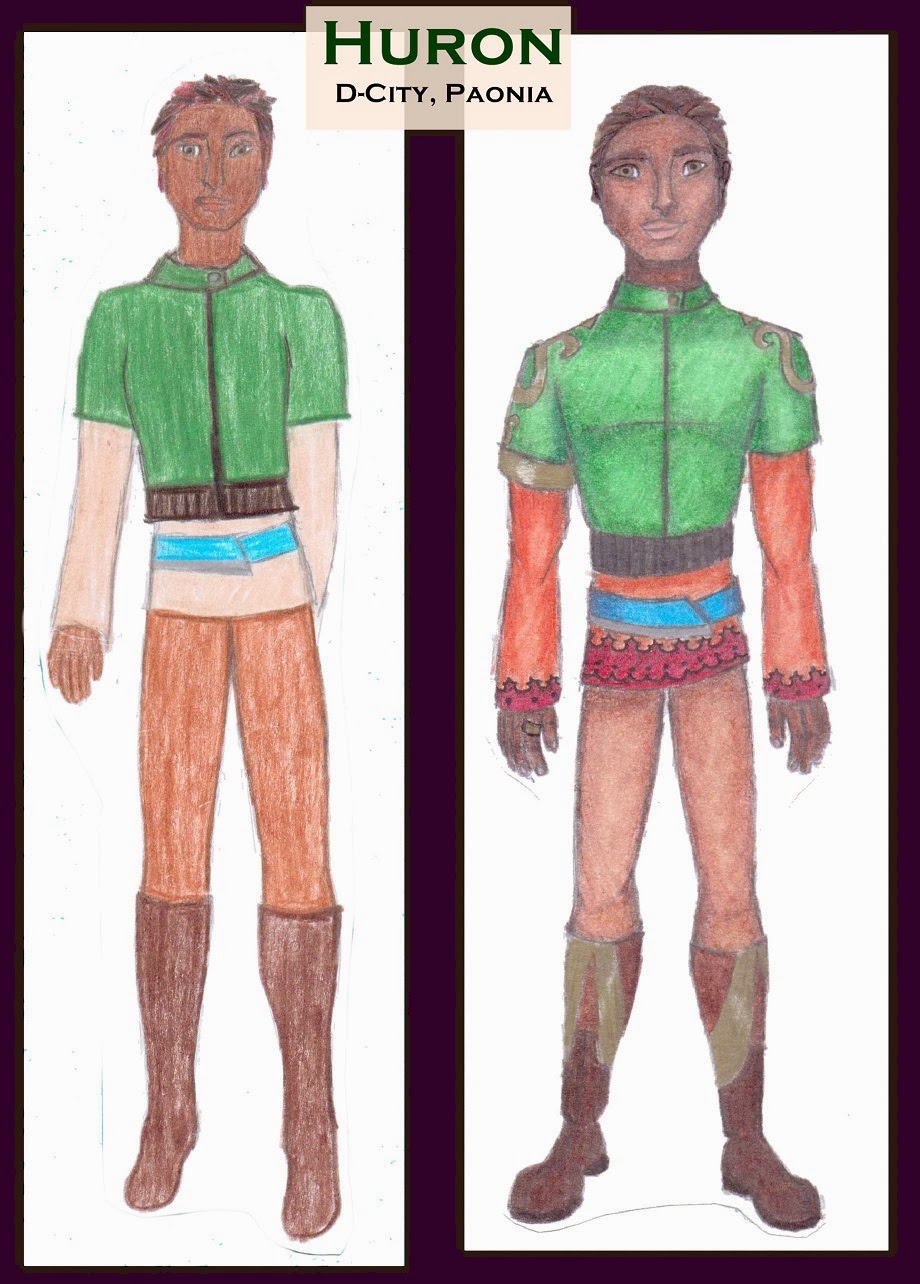
For my first Old to New, Before and After Illustration, I chose one that was both dramatic and straightforward. Good old Huron.
Clearly my first go at this Character has been a while ago: My coloring skills were basic, my understanding of drawing the male figure was, we'll say, incomplete, shading is non existent, as is fabric draping, and (the worst offense) he has floating feet. Sadly feet took me a good long while to master.
My redo is clearly the same character, just cleaned up a bit and with a few more details added to make him more interesting and better suited to an imaginary world (let's face it my first attempt was standard and boring - it begged for some embellishments). All in all, an inarguable improvement.
That being said, part of the reason I chose Huron is because he is, again, just about due for an update. Why he hasn't received one as of yet is that there are still other much more desperate cases (if you doubt this look again to the left).
Here again is the Curse of Progress. I like this updated Huron. His form is good and the overall look I'm still pleased with. However, the art materials have advanced. He was done years ago on scrap paper with Crayola colored pencils - perhaps with touches of Prang. Now I use Prismacolor colored pencils and Copic Markers. The difference when the pictures are side by side is astounding. Sorry Crayola, but the old pictures look faded and washed out in comparison to the new, vibrant coloring.
Come back tomorrow to see what I mean.


No comments:
Post a Comment